Let's try this again
After finishing the first 2 pieces of the East Meets West bag, I stopped and had a decision to make: continue or change course.
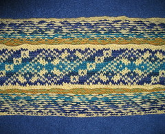
The strap has its moments.

East Meets West - strap
The yellow and green/blue strap is fine by itself.
East Meets West - strap detail
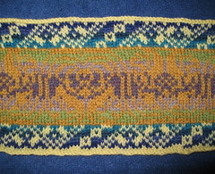
But I didn't make a good choice for the bottom of the bag.

East Meets West - bottom
The tumeric color is supposed to be the dominant figure.
East Meets West - bottom detail
I substituted green for the pink that came in the kit, but it wasn't a great choice because the color value of the green is very close to the tumeric so the figure disappears in the background. The only background color that works with the tumeric is the dark purple heather in the center.
Here's the other issue I saw--

Not feeling it
The strap and the bag don't relate as well as I'd like. To my eye, they look like they could belong to different projects.
What to do? Call in the reinforcements!
I enlisted Spinnity's help in picking colors for a new strap/bottom for the bag. She has a better eye for color than me and has a greater knowledge base for such things.
I brought all the Palette in my stash and we dumped everything on the floor and started pulling colors.

Choosing colors
I must admit, I was overwhelmed. Thankfully Spinnity kept plugging away and came up with some really good combinations. She was definitely the right person for the job.
I learned a few things going through this process--
Checking Color Values
Have you heard of putting your yarn in a copy machine and making a B&W image to check for color values? It's a great way to take color out of the equation and just look at value. We applied technology to the copy machine approach and used my digital camera's B&W mode to get the same affect.
Color interaction
How a color appears depends on the colors it is next to. For example, a blue might look different flanked by greens than it would flanked by purples. I was comparing colors by holding balls of yarn together, but that didn't tell the whole story. Spinnity showed me that wrapping about an inch width of each yarn on a folded piece of paper in the order that they will appear in the piece gives a better representation of the colors with their neighbors.
Here are the color values of the current piece and the new colors for the bottom insert wrapped on paper:
Color Values
See how values of the figure and background of the bottom insert are practically the same except in the center section? That's the dark purple heather background color. No wonder!
Now here it is in living color. The new combination reminded us of Monet's Water Lilies.

Colors
While picking the new colors we considered how close in value the Tidepool Heather in the center of the paper is to the Cyan on each side, but we counted on Cyan's "I will not be ignored" character to punch through.
Colors for the strap were picked in a similar way and now the strap and the bottom relate much better to the front and back of the bag.
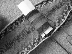
The new strap/bottom is on the needles and I'm very happy with the new colors.

Starting again

Much better
Thank you so much Spinnity for helping me with this, I absolutely positively could not have done this without you.
Now I wish we had planned out the colors for the entire bag.
The strap has its moments.
East Meets West - strap
The yellow and green/blue strap is fine by itself.
East Meets West - strap detail
But I didn't make a good choice for the bottom of the bag.
East Meets West - bottom
The tumeric color is supposed to be the dominant figure.
East Meets West - bottom detail
I substituted green for the pink that came in the kit, but it wasn't a great choice because the color value of the green is very close to the tumeric so the figure disappears in the background. The only background color that works with the tumeric is the dark purple heather in the center.
Here's the other issue I saw--
Not feeling it
The strap and the bag don't relate as well as I'd like. To my eye, they look like they could belong to different projects.
What to do? Call in the reinforcements!
I enlisted Spinnity's help in picking colors for a new strap/bottom for the bag. She has a better eye for color than me and has a greater knowledge base for such things.
I brought all the Palette in my stash and we dumped everything on the floor and started pulling colors.
Choosing colors
I must admit, I was overwhelmed. Thankfully Spinnity kept plugging away and came up with some really good combinations. She was definitely the right person for the job.
I learned a few things going through this process--
Checking Color Values
Have you heard of putting your yarn in a copy machine and making a B&W image to check for color values? It's a great way to take color out of the equation and just look at value. We applied technology to the copy machine approach and used my digital camera's B&W mode to get the same affect.
Color interaction
How a color appears depends on the colors it is next to. For example, a blue might look different flanked by greens than it would flanked by purples. I was comparing colors by holding balls of yarn together, but that didn't tell the whole story. Spinnity showed me that wrapping about an inch width of each yarn on a folded piece of paper in the order that they will appear in the piece gives a better representation of the colors with their neighbors.
Here are the color values of the current piece and the new colors for the bottom insert wrapped on paper:
Color Values
See how values of the figure and background of the bottom insert are practically the same except in the center section? That's the dark purple heather background color. No wonder!
Now here it is in living color. The new combination reminded us of Monet's Water Lilies.
Colors
While picking the new colors we considered how close in value the Tidepool Heather in the center of the paper is to the Cyan on each side, but we counted on Cyan's "I will not be ignored" character to punch through.
Colors for the strap were picked in a similar way and now the strap and the bottom relate much better to the front and back of the bag.
The new strap/bottom is on the needles and I'm very happy with the new colors.
Starting again
Much better
Thank you so much Spinnity for helping me with this, I absolutely positively could not have done this without you.
Now I wish we had planned out the colors for the entire bag.
Labels: colorwork, Fair Isle, friends, instruction/technique, stranded, wool

4 Comments:
Ha-HAH! I love the choices, Janice. It's just great that you can finally see the flower figure. Great instincts to make the change, and it was so much fun messing with your paint box of Palette.
By spinnity, at 2/23/2010 12:01 PM
Wow - it looks so complicated like a piece of art. I am sure the final piece will look fantastic with all those colors!
By Ann, at 2/23/2010 3:57 PM
Yeah its so nice. i like it a lot...
By russellville arkansas, at 2/25/2010 5:35 PM
I love the new color choices!
By Anonymous, at 3/20/2010 5:41 PM
Post a Comment
<< Home